

Letter no. 3: Up & Down Like A Yo-Yo

Hey guys!
Since my last letter we saw bitcoin going up towards to the 47k level and from there down to the 40k - 42k levels.
Most be noted that Bitcoin’s last sell-off is affected by macro parameters which I will not dive into in this letter. But I will surely analyze the current situation to see if any fundamental on-chain data has changed due to the last sell-off.

On-chain Analysis
At times of high volatility, rapid runs up and sell-offs the main on-chain categories I’m focused on are Spending Behavior, Coin Maturation and Supply Dynamics.
Spending Behavior
Let’s start off with Spending Behavior. Long-tern holders which are known as ‘HODLers’ are market participants with vast experience with BTC and have been through volatility and complete cycles, therefore they’re knowledgeable how to navigate the market. That’s why we should pay attention to their spending behavior which can give us an indication of profit-taking / accumulating opportunities.
Let’s start this section with ASOL, which is the average age in days of spent transaction outputs, this is a useful tool at times of low network volume. It’s providing insights to the balance between short-term and long-term spending behaviors.

The metric currently trending down, unlike the mid of the bull run where it went higher due to whales and long-tern investors spending periods.
This signals that mainly young coins are spent (averaged lifespan of 43 days) which are mainly held by speculators and traders, those market participants affect the market in the short-term unlike long-term investors who determine the long-term trajectory.
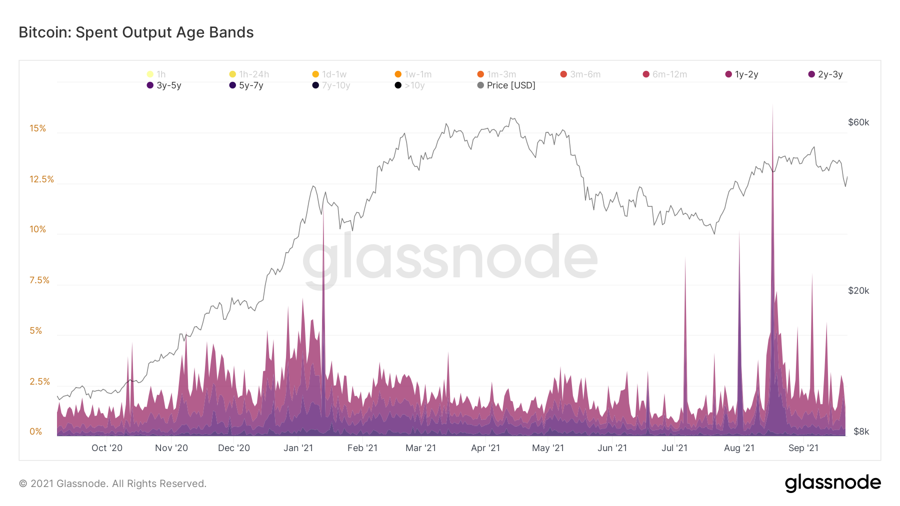
Secondly, Spent Output Age Bands which categorizes spent outputs by their age into specific age bands.

These cohorts represent long-tern hodlers. We can see that they’re a bit elevated due to profits taking coming from the 6m-1y cohort but still staying at a normal levels. Taking a more specific look, we can see that the older cohorts (1y and above) are at very minimal spending levels; this is the bullish signal we’re looking for.
Lastly, looking at Dormancy which is the average number of days destroyed per coin transacted. Higher dormancy’s levels means older coins are spent and vise-versa.

We can see clearly the downtrend and low levels of the metric, signaling that mainly young coins are spent. On the other hand, old coins are staying dormant; HODLers are holding strong and probably accumulating too.
Coin Maturation
Starting this section with HODL Waves, a positive phenomenon showing up in this chart; continued swelling of the 6m-1 cohort.

Which means coins from younger cohorts ( 1m-6m) are gradually being matured into the 6m-1y cohort. This is another signal of market HODLing sentiment.
Finishing with Reserve Risk which is the ratio between BTC’s price and the HODL Bank. Simply put, the ratio between the incentive of long-term hodlers to sell against their conviction to continue HODL the coins (HODL Bank).

The metric is affected to the downside because price is decreasing and HODL Bank is increasing. According to spending behavior and coin maturation we can say that HODL Bank is increasing (LTH not spending), so the downtrend is not coming only from price decrease.
HODL Bank increasing and Reserve Risk decreasing is a signal that the conviction & confidence to HODL are high.
Supply Dynamics
I will start this section with supply held in exchanges; market participants holding coins in exchanges tending to sell them, and coins held off exchanges in cold-wallet are mainly meant for long-term HODL.
Never in Bitcoin’s lifetime we saw such a massive decrease in coins held in exchanges.

In my opinion, this is a signal of the positive changing behavior of Bitcoin investors, which are more convicted that it has the potential to change the current financial system, therefore the massive willing to HODL.
Another angle to attack exchanges supply is to look at Exchange Net Position Change. Although the last sell-off, coins are continually being scooped-off exchanges.

These are probably long-term HODLers taking advantage of the price decrease to accumulate more cheap coins.
I will round up this section with Bitcoin Young and Old Coin Supply, a clear uptrend in old coins supply; long-term HODLers who hodl old coins are not spending or minimizing spending therefore old coins supply is increasing.
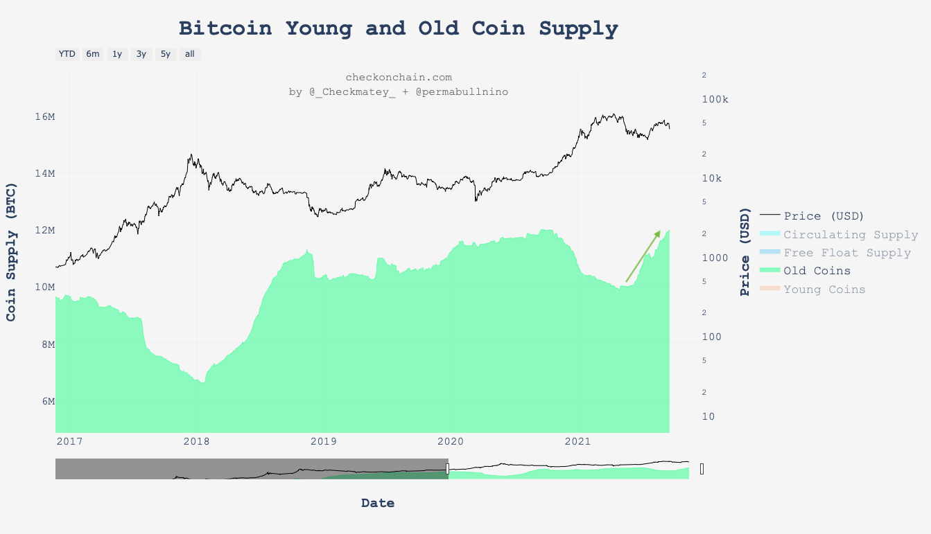
It’s when old coins supply start decreasing that will signal the beginning of another macro uptrend.

I will round up this letter with a comparison metric I did with Glassnode’s workbench; a recommended tool if you want to start play with charts and create your own.
The comparison is between Exchange Net Position Change which is the 30d change of supply held in exchanges, and SSR (Stablecoin Supply Ratio) Oscillator which quantifies how the 200d SMA of SSR is moving within Bolinger Bands.
When SSR Oscillator is increasing it means stablecoins denoted in BTC are used to buy BTC.

Once SSR Oscillator crossed Exchange Net Position Change to the upside while it’s decreasing it signaled / approved an uptrend. We can see that four out of five data points the comparison metric managed to indicate for an uptrend. The only time it failed was at the COVID crashed which is event not possible to identify by on-chain data.
Right after the end of May sell-off a signal happened, this is another positive indication that a macro uptrend is upcoming / happening.
Conclusions
Although BTC having a difficult time lately, on-chain fundamental data is staying healthy. So far no red flags appearing, therefore I would expect a continue to the upside in the upcoming weeks. Take into consideration that broader macro market is affecting BTC, thus we might see some downside before heading back up.
Thank you for reading and take care!
Disclaimer
Nothing written in this newsletter is to be considered as an investment / trading advice, do your own research.
If you found this letter helpful and informative I’d appreciate your subscribe and share, this way I’ll be able to reach more people.